New Looks - New Stars - New Logos
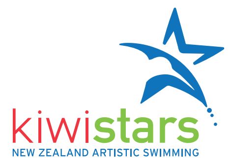
At the end of last year Clubs and Coaches were given a chance to see what the new KiwiSTARS skills program would look like in a country-wide skype session. Our goal was to simplify the whole program and make sure it reflected the new FINA rules, as well as making the levels easier to understand for eligibility to swim in the North/South Islands and Nationals. We now have a new logo to reflect the new program, which will appear on our website and on printed materials.
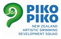
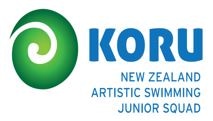
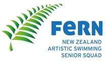
As well as redesigning the KiwiSTARS logo, we’ve been tidying up our Squad logos to reflect our move towards Artistic Swimming. The Silver Fern is an iconic symbol of New Zealand Sport – all major codes use it in some way. For some years now we have used the names Pikopiko, Koru and Fern for our talent development squads. What many people don’t know is that these three words represent the natural stages of development of the Silver Fern – the Pikopiko is the tightly furled fern, the Koru is as it unfurls a little more and the Fern is the fully developed finished product. This beautiful story of growth and development features in our squad logos.
Next we’re moving onto our event logos – for North and South Islands (that will remain the same for several years), and for Nationals. And finally we will finish with the new logo and new name for Synchro Swim NZ when it becomes New Zealand Artistic Swimming.
We’ve been very lucky to have Natasha Cuisel, a member of our synchro community, do all our design work. She runs her own agency based in Queenstown, and in her spare time runs the Alpine Synchro club! We’ve loved working with her – and also loved not having to explain synchro to her! She gets it already.